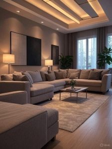
 Lighting and layout impact how people experience both physical rooms and websites. Interior design depends on visual balance, proper space usage, and how light interacts with objects. These same elements play a growing role in web design. Clear structure, intuitive flow, and mood-setting color choices all contribute to how a visitor feels while browsing a site.
Good design decisions—online and offline—create comfort, clarity, and emotional appeal. That’s why companies like Eschmedia apply interior design concepts to their website builds. Whether it’s natural lighting in a home or strategic white space on a webpage, these details make the environment feel more human. Eschmedia combines clean layout, soft color palettes, and logical navigation to deliver websites that feel as thoughtful as a well-designed living space.
Why Balance and Symmetry Matter
Balance helps both rooms and digital pages feel more inviting. In home design, symmetrical furniture placement offers stability. A centered coffee table or matching side lamps create order. The same idea applies to web layouts. Well-aligned elements—headers, images, menus—guide the eye and reduce mental load.
Asymmetry, when used wisely, adds creative energy. Designers may purposely shift elements to one side to create visual tension. Eschmedia uses this technique online to draw attention to key content, just like a spotlight might highlight a feature wall in a living room.
Color Affects Mood Instantly
Colors guide emotion and attention more than any other design choice. In homes, warm tones like amber, gold, and cream provide a cozy feeling, while cool tones like blue and gray bring calm. On websites, these same choices direct how users feel and interact.
Web designers use color to influence behavior, just like lighting designers do in physical spaces. A bright CTA button or a soft background tone helps users focus. When these colors mimic real-life environments, people feel more comfortable staying longer on the page.
Lighting and Visual Hierarchy Work Together
Lighting in interiors sets focus, depth, and rhythm—and so does visual hierarchy in web design. Layered lighting plans help define different zones within a room. Similarly, web designers create sections with varied text sizes, shadows, and spacing to guide users through content smoothly.
Bright spots in web design act like accent lights in a room. They highlight important buttons or images. Eschmedia builds digital pages that naturally “light up” areas of interest, keeping users engaged through thoughtful emphasis and balance.
To learn more about designing a good lighting system for your home, read also: How to Design a Good Lighting System
Texture and Depth Create Comfort
Texture brings warmth and realism into both interior spaces and web interfaces. In a living room, textures come from rugs, fabrics, wood grains, or stone finishes. Online, depth is created using layered backgrounds, image overlays, shadows, and gradients.
Well-applied texture on a website keeps it from feeling flat. Eschmedia adds subtle visual layers that simulate the depth of real materials, helping users feel grounded in the digital space. It’s a sensory illusion that enhances both style and usability.
Spacing and Flow Improve Usability
Open space isn’t wasted—it’s essential for usability and relaxation. Designers leave space around furniture for movement. On a website, spacing between elements improves readability and touch navigation. Clutter causes stress. Whether it’s a crowded corner or a crammed homepage, less breathing room means less user comfort.
Consistent spacing makes browsing feel effortless. Eschmedia uses spacing patterns that echo smart room layouts—where everything has its place, and nothing competes for attention. That structure helps users move naturally from section to section, just like walking through a well-planned home.
How Eschmedia Applies Interior Design Thinking to Web Projects
Eschmedia designs websites that feel as intuitive as stepping into a well-lit room. They use consistent color schemes, layout grids, and soft transitions to create a calm and confident user journey. Their attention to spatial flow and visual balance mirrors what interior designers aim for when planning physical environments.
Their work supports both beauty and business goals. By applying interior principles—like focal points, flow, and simplicity—they build websites that attract attention and drive action. Whether it’s a portfolio site or a commercial page, their design language helps brands stand out while staying grounded in user comfort.
Your Website Deserves the Same Care as Your Living Space
A beautiful, well-lit home creates peace and connection. A well-designed website does the same. It welcomes, informs, and leaves a lasting impression. Thinking like an interior designer when building digital spaces means understanding how color, light, layout, and rhythm impact emotion.
If your business values visual impact and clear messaging, combining interior insight with strong web strategy is the next step. Lighting companies, home decorators, and lifestyle brands can benefit from design that speaks the same language online and offline.